> For the complete documentation index, see [llms.txt](https://help.tillit.cloud/tillit/llms.txt). Markdown versions of documentation pages are available by appending `.md` to page URLs; this page is available as [Markdown](https://help.tillit.cloud/tillit/knowledge-base/setting-up-tillit/activity-templates/activity/elements/element-types/item-properties.md).

# Item properties

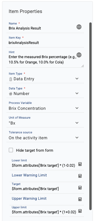
When editing an existing element, you will use the Item Properties:

<figure><img src="https://352909507-files.gitbook.io/~/files/v0/b/gitbook-x-prod.appspot.com/o/spaces%2FrNT40XJFAFlAhUX8CcQS%2Fuploads%2Fgit-blob-d25c307fdedd5b0a26f236ea61489b052caccc16%2Factivity-form-widths-item-properties-panel-top.png?alt=media" alt="Item Properties panel showing Name, Item Key, Hint, Item Type, Data Type, Process Variable, Unit of Measure, and Tolerance source fields"><figcaption></figcaption></figure>

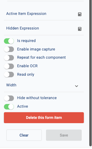
<figure><img src="https://352909507-files.gitbook.io/~/files/v0/b/gitbook-x-prod.appspot.com/o/spaces%2FrNT40XJFAFlAhUX8CcQS%2Fuploads%2Fgit-blob-868f9bfeb590ec3f1d66d5030ffc23f82be37d41%2Factivity-form-widths-item-properties-panel-bottom.png?alt=media" alt="Item Properties panel showing Active Item Expression, Hidden Expression, toggles including Width, and the Delete/Clear/Save buttons"><figcaption></figcaption></figure>

The available properties for an element will be determined by the Item Type and/or Data Type.

You can click on the complex properties for more details on how they can be used.

### Fields

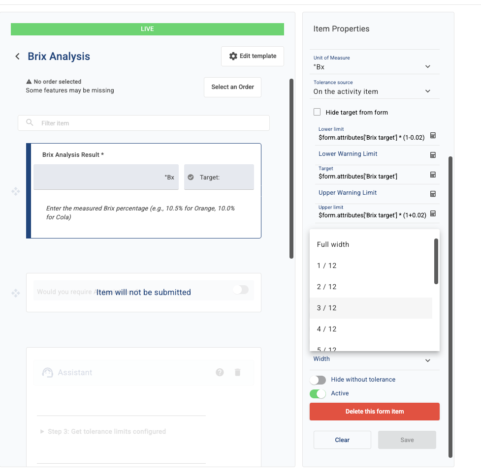
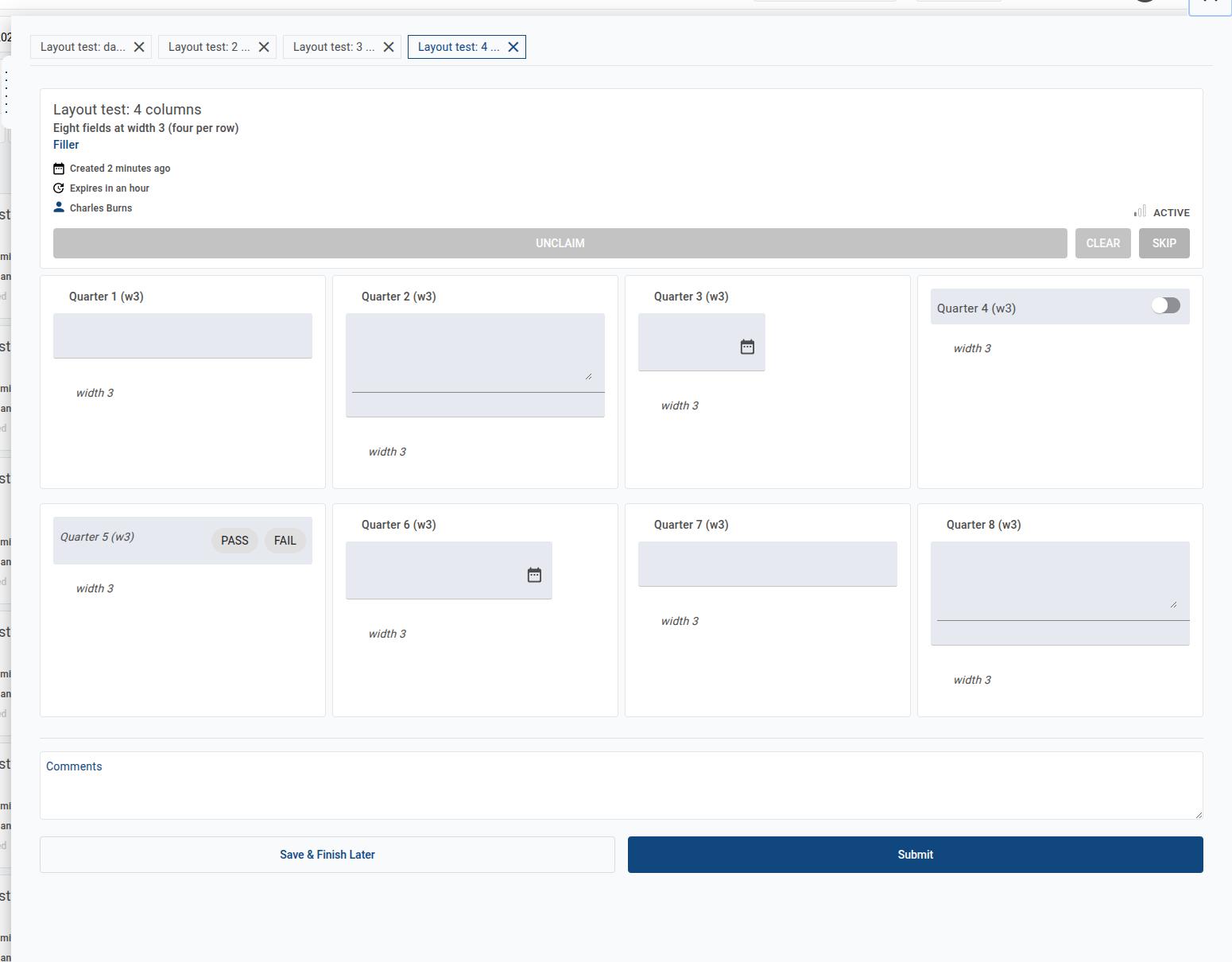
<table><thead><tr><th width="211.546875">Name</th><th>Description</th></tr></thead><tbody><tr><td>Name</td><td>(mandatory for all elements) the name of the element.</td></tr><tr><td>Item Key</td><td>(mandatory for all elements) the key of the element.</td></tr><tr><td>Hint</td><td>(optional - available for all elements) add text and html links to offer users more context around an element.</td></tr><tr><td>Width</td><td><p>(optional - available for all elements) sets how many of the 12 grid columns the item occupies on the activity form. Items left blank take the full row; items with widths that together add up to 12 or less sit side by side on the same row.</p><p><img src="https://352909507-files.gitbook.io/~/files/v0/b/gitbook-x-prod.appspot.com/o/spaces%2FrNT40XJFAFlAhUX8CcQS%2Fuploads%2Fgit-blob-c58c389d831b928d4a2d011ce9ee54d7547e70f4%2Factivity-form-widths-width-selector.png?alt=media" alt="" data-size="original"></p></td></tr><tr><td>Item type</td><td>(mandatory for all elements) decides the behaviour expected from the element.</td></tr><tr><td>Data type</td><td>(mandatory for all elements) decide how the value of the item type is captured.</td></tr><tr><td>Calculation</td><td>(only available on Data types: Calculation, Read only note) allows you to configure a calculation using math and/or JavaScript. Attributes and Item Keys can be references in the calculation. For a read only note, it allows you to use attributes for any variable value in a note.</td></tr><tr><td>Options</td><td>(only available on Data type: Option list) choose from a configured list. Available as single, multiple or tree options.</td></tr><tr><td>Barcode field length / Barcode fields</td><td>(only available on Data type: Barcode) barcode fields must be defined by length of field within the barcode and the name of the field. The barcode fields must refer to Item Keys within the activity form. For example, an 11-digit barcode could be split into 3 fields; customer (first 2 digits), product (next 4 digits), serial (next 5 digits).</td></tr><tr><td>Process Variable</td><td>(optional - available for all elements) represents the measured value or parameter of a particular part of a process which is being monitored and controlled. Usually, a process variable is linked to a PLC tag via a TilliT Edge device, where actual values are being referenced.</td></tr><tr><td>Attribute</td><td>(only available on Item type: Update Attribute) a property definition and can be related to an Asset, Material or Order. The attribute definition will provide additional context for operational control and compliance.</td></tr><tr><td>Tolerance source</td><td>(only available on Data types: Number, Calculation, Edge Data) sets the source of the tolerance for this element. You can have none, on the material, on the asset, on the order, on the activity item or on the process variable. If you choose activity item, you will be asked to set a Lower limit, Target and Upper limit. If you set a target, but not upper and lower limits, the result must be an exact match. If you set a lower and/or upper limit, the result must be within that upper/lower range. You can also choose to hide the target from users.</td></tr><tr><td>Active Item Expression</td><td>(optional - available for all elements) create a mathematical or JavaScript evaluation. If the result is true, the item will be active in the form and submits data.</td></tr><tr><td>Hidden Expression</td><td>(optional - available for all elements) create a mathematical or JavaScript evaluation. If the result is true, the item will be hidden in the form, but still remains active and submits data.</td></tr></tbody></table>

Items set to different widths render side by side on the same row of the activity form:

<figure><img src="https://352909507-files.gitbook.io/~/files/v0/b/gitbook-x-prod.appspot.com/o/spaces%2FrNT40XJFAFlAhUX8CcQS%2Fuploads%2Fgit-blob-0fa25709e1301812792a76e9fd38593e0b2679f8%2Factivity-form-widths-item-render.png?alt=media" alt="Activity form showing items of different widths sitting side by side"><figcaption></figcaption></figure>

### Toggles

<table><thead><tr><th width="212.5859375">Name</th><th>Description</th></tr></thead><tbody><tr><td>Is required</td><td>when activated, this item must be completed and must be within any configured tolerances/targets, otherwise the activity will fail.</td></tr><tr><td>Enable image capture</td><td>provides a camera button to take and/or attach images from the user's device.</td></tr><tr><td>Repeat for each component</td><td>repeats the element for every material component that is being produced on this order (see Material Components).</td></tr><tr><td>Read only</td><td>makes the element read-only (i.e. the user can view, but not enter/edit the data for this item).</td></tr><tr><td>Active</td><td>makes the element active or inactive in the form. This allows you to "switch off" items instead if deleting them.</td></tr></tbody></table>

### Buttons

<table><thead><tr><th width="211.60546875">Name</th><th>Description</th></tr></thead><tbody><tr><td>Delete this form item</td><td>deletes the element from the activity template.</td></tr><tr><td>Clear</td><td>clears all optional properties from the element.</td></tr><tr><td>Save</td><td>saves any changes made in the element's properties. You must click this to apply any changes.</td></tr></tbody></table>